Our story

The world we’re in:
Customer experience is a crowded space full of companies building tech with advancements in AI and ML technology. They promise a better, more personalized experience for the customer, but rarely fulfill it. Feeling alone and frustrated, customers are left thinking, “ With so many ways to communicate these days, why is it so hard to be seen and heard?”

Who we’re working for:
Customers. Because, if we’re successful, our clients and their team of agents become the heroes.

What we’re fighting against:
Experiences and technology that make customers feel alone.

Who are we:
By leading with accountability and empathy, we become a guide for some of the world’s biggest brands. We are the behind-the-scenes team making sure every moment is flawless for the customer. This makes customers feel seen and heard, but allows our clients and their agents to be the heroes of the story.
Our mission

We enable people to get the help they need, from the brands they love, on the terms they choose.

Our voice

When we put pen to paper, we aim for the experience we empower our clients to give. So we pass every word through the lens of relationship and reason, knowing we’re writing to real people that talk just like you or me.

Start with empathy for your audience.

Aim for harmony, balancing your message’s goal against the reality of where the recipient is coming from.​

Meet people where they are and make them excited for where you’re headed together.

Write for all readers. Some people will read every word you write. Others will just skim. Help everyone read better by grouping related ideas together and using descriptive headers and sub headers.

Tell a story. Know your narrative and stick with it. It’s our job to keep our audience our focus and engage with them every step of the way.

Be concise. Use short words and sentences. Avoid unnecessary modifiers. “Before you leave the house, look in the mirror and take one thing off.” – Coco Chanel. Each time you complete a sentence or paragraph, challenge yourself to make it shorter and clearer.

Be friendly. Speak as though you’re chatting with a close friend or explaining something to a neighbor. Don’t stray away from showing personality! A bit of spark will hold more attention. And don’t assume people know acronyms or jargon—we want our language to be accessible to as many people as possible.

Write positively. Try to always craft messages positively whenever you can.

Add Personality. Emojis are a fun way to add humor and visual interest to your writing, but use them infrequently and deliberately. Use contractions—they’re always a good fit.​

Use everyday language. After you write something, read it out loud. If it sounds formal or clunky, try writing it as if you’re speaking to someone in the room.

Here are a few key elements of writing in Mindful’s grammatic style.

Headings and titles

Titles should almost always be title case. This includes titles of webinars, blog posts, book chapters when given its own page or title section, presentations, etc. We use the AP style for capitalization. To generate proper capitalization, go to this site, switch to Chicago, and enter the title—the site will automatically fix the title to the correct capitalization!

Headings should always be sentence case, aim to be in active voice, and have periods when composed in a full sentence.

Title Why the Text Channel Is a Must-Have to Meet Customers
Headings Benefits of offering an SMS text channel
SMS is immediate.
Text messages get opened.

Acronyms

If there’s a chance your reader won’t recognize an abbreviation or acronym, spell it out the first time you mention it. Then use the short version for all other references. If the abbreviation isn’t clearly related to the full version, specify in parentheses. If the abbreviation or acronym is well known, like API or HTML, use it instead (and don’t worry about spelling it out).

List of acceptable abbreviations: API, HTML, UX, CX, ACD, CCaaS

First use: multi-experience (MX)
Second use: MX

Bullets, lists, and colons

Colons

When written in a sentence, there are two ways colons should operate. If what follows a colon is a full sentence, then the first letter following a colon should be capitalized. If what follows is a fragmented sentence, then do not capitalize.

Full sentence Here’s the bottom line: He loved his chocolate cake.
Incomplete He loved everything chocolate: bars, fondue, and cake.

Bullets

Bullets are great! Make sure they’re capitalized and include a period if it’s a full sentence.

Capitalization

As mentioned above, titles should be title case, everything else should be sentence case.

If you are writing about a specific feature, the feature may be capitalized if it is a proprietary feature. The following features should be capitalized:

  • Mindful Scheduler
  • Mindful Callback
  • Mindful Feedback
  • Mindful Handoff
  • Digital Intents

Commas

We use the Oxford Comma. In addition to the Oxford Comma, writers can use additional, unconventional commas where it would break up the sentence naturally if someone was speaking the sentence out loud.

Example Mindful was designed and developed with them in mind, and our teams continue to work with clients to make industry-leading recommendations.

Date and time

Standard format May 12 at 9am Pacific | 12pm Eastern
Alternative format May 12 at 9:00am PST | 12:00pm EST
Australian format 12 May at 9:00am AEST

Dashes, hyphens, and parentheses in lieu of semicolons

Dashes/hyphens: Use em dashes (one of these — ) to separate quick thoughts and break up sentences. The goal here is not to stretch out a sentence, but to emphasize certain points, and break it up in a way that would sound natural if speaking the sentence out loud. We follow the Chicago style guide and use an em dash without any spaces around it.

Example Update call targets, priority queues, and more in seconds—all without filing an IT ticket.

Semicolons: Since many people don’t understand the meaning behind using a semicolon (or the proper use thereof), if you’re about to use a semicolon, opt for an em dash instead.

Do It doesn’t have the immediacy of a phone call—nobody likes to hear, “Let me put you on hold while I look that information up.”
Don’t It doesn’t have the immediacy of a phone call; nobody likes to hear, “Let me put you on hold while I look that information up.”


Parentheses: This is another useful tool to break up a sentence and work in quick notes or sideline thoughts on the subject without derailing the point.

Example This is omnichannel (as opposed to multi-channel) support.

Numbers

We follow the Chicago style, outlined below.

  • Spell it out from zero to nine.
  • Use digits for numbers higher than 10.
  • For cents or amounts of $1 million or more, spell the words cents, million, billion, trillion(ex: $26.52, $100,200, $8 million, 6 cents).
  • If you start a sentence with a number, no matter the amount, it should be spelled out (ex: “Sixty percent of customers chose callback.”)

Our logo

As we grow and change, the essence of what we do remains constant:
We facilitate better conversations between brands and their customers.

No matter what technology may be involved, this is the premise that we’ll build upon as we move into the future. As a brand, we’ll craft solutions for these vital conversations with elegant simplicity.

Our logo is a reflection of this promise.

Download logos

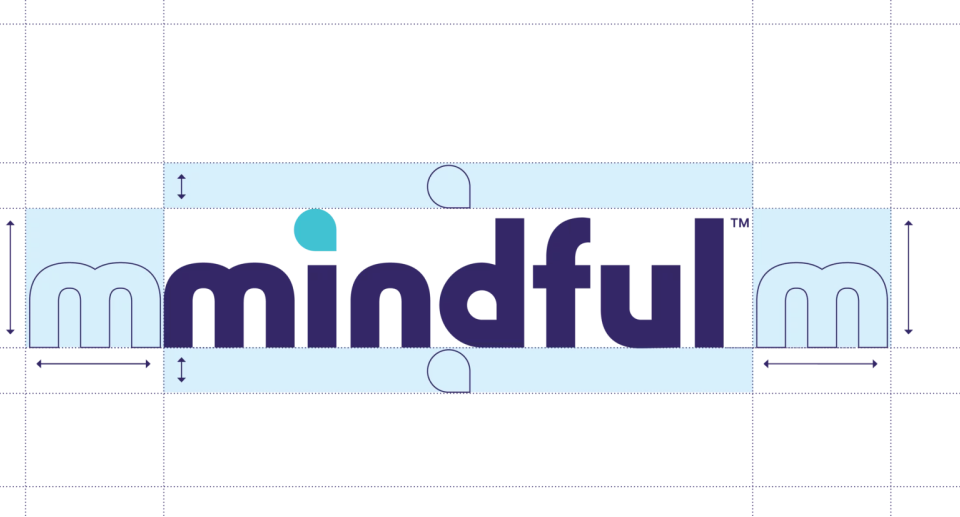
If the logo is cramped or crowded, it loses legibility and impact. Maintain a minimum amount of space between the logo and other graphic elements or the edge of the composition. A good rule of thumb for determining the minimum spacing is to use the x-height of the letters (the height of the crossbar in the ‘t’) as a unit of measurement for both vertical and horizontal space.


Give the logo a little room to breathe.

Ahhhhh, that feels better.

There are a few variations of the logo available for use. Each variation has been designed for a different context in which the logo might appear. Read the descriptions of each variation to determine which one you should use for your project.

The standard logo
Tried and true. Use this logo variation by default. It works best on light or white backgrounds.

The reversed logo
I put my thing down, flip it and reverse it
This logo variation works best on dark backgrounds.


The one-color logo
If neither of the primary logos look good in the target context, a one-color logo might be just what you need. Use this variation if the logo cannot be placed on white or one of the brand colors.


The monochromatic logo

Okay, now let’s have some fun. Use this variation placing the Mindful logo on top of one of our light colors, please use the dark variation of that color for the logo.


Important!
These colored logos should NOT be used outside of the monochromatic setup.


The Mindful by Medallia logo is secondary.
Because of opportunities to cross-sell, we want to strategically place the usage of the Mindful by Medallia logo and lingo. But it will be secondary in our usage.

Mindful by Medallia logo

Where the Mindful by Medallia logo should be used:

  • Top of the website
  • Added to the bottom of all one-sheet
  • Added as an explainer slide to deck
  • Added social headers


Where the standard Mindful logo should be used:

  • Marketing collateral like: display ads, booth graphics, promotions, and resource
  • Logo on the top of all one-sheets (bottom logo will be Mindful by Medallia
  • Email signature
  • Documentation
  • Presentations (we will add an optional slide that says we are a Medallia company that can be added to the beginning
    of presentations for lead passing)
  • Partner assets (app stores, collateral, etc)

We love to collaborate with partners, clients, and sometimes just great friends.
When we do this, we use this lockup so that we can spread the logo love.

Please follow these guidelines on the proper usage of the Mindful logo.
We appreciate it, and you.

Yes
Keep it up, you’re lookin’ good!

Love that pairing. So zen.

Nice contrast on that background.

Great use of spacing and color choice! Noice!

Please follow these guidelines on the proper usage of the Mindful logo.
We appreciate it, and you.

No
Please avoid these. If you need help, reach out!

Don't stretch.

Cool color, just not one of ours.

That feels a little too tight, give that sucker a little breathing room.

Our colors

Our colors and gradients have meaning, intent, and were chosen with love. The use of a soft, muted color palette invites people in and makes them feel at ease. The warmth we show makes people more likely to engage with our brand. Click for easy access to hex values.

Our primary colors consists of Purple-Dark, Teal-Medium, and White as reflected in our primary logo. When in doubt, stick to the palette.

Hover to see accessibility states. Please adhere to them so that our brand can be enjoyed by all. There are a lot of colors here, best rule to keep in mind is to pair them monochromatically together for best results.

The colors below are used to identify different states of components within the marking site and the app.

Our gradients play a strategic role in how we visually show harmony. Use them to show connection between people and platform abilities, and to blur how we add texture and depth without taking away from the content.

Gradient for dark backgrounds

#FFC6DB #C79AFA #85F8FF #B0FFDD

Gradient for light backgrounds

#F593C0 #B292DE #6ED6DD #93DBB3

For blurs, we use a mix of Light Colors and Mid Colors and a layer blur at a min of 100 and a max of 200.

Add varying sizes and contrasts to make it more dynamic.

Important! 

These colors should never interfere with legibility of content. When in doubt, remove it or contact the brand team.

For copy
Copy and copy hierarchy are important. That is why we only use specific color when pairing with type. That way everyone can see and read it.

This is a link and we do those in Blue-Dark #2C7890

Dark Colors
The Mindful Dark Color group is primarily intended to be used on top of Light Colors.

Mid Colors
The Mindful Mid Color group is intended to primarily be used in illustrations.

Because of the Mid Colors’ proximity to their light and dark counterparts, their contrast is usually low and typically they cannot be used as text colors on either light or dark backgrounds. (Reference the palette to check specific combinations.)

Light Colors
The Mindful Light Color group is intended to provide a sense of calm and comfort for the viewer.
Because of this, they are to be primarily used as background colors and as fills for background shapes.

The use of background colors helps to differentiate sections in a layout, as well as provide a calming visual break between elements.

Light colors can also be used for type fills if their dark counter part is being used as a background color. This scenario will primarily play out in print/swag items, but due to its contrast ratio, could also be used in digital mediums.

Examples
Sometimes seeing it in practice can help.

Yes
Keep it up, you’re lookin’ good!

Who knew monochromatic orange could actually look good?!

Great spacing and color pairing.

Great use of the rainbow. 
Also, Meet Jared, Director of Content and Profile Model.

No
Please avoid these. If you need help, reach out!

Remember to always pair monochromatically. Light with Dark Colors.

Whoa Nelly! Blur can’t obstruct content.

That might be a bit much.
 Use sparingly so it packs a bit punch!

Our type

Communication is important. We use Fraunces 900 Super Soft* and Inter Medium are used as the perfect pair to provide friendly clarity.

*Google slides is a little different, we use Fraunces Black since there not as many specific options.

This is Fraunces 900 super soft and we use it for headline copy.


This is Inter Medium and we use it for body copy. This is Inter Medium and we use it for body copy. This is Inter Medium and we use it for body copy. This is Inter Medium and we use it for body copy.

Download fonts

Ratios and pairings are important when creating hierarchy and legibility. Here are some popular pairings and ratios that we use.

128px


64px


32px — I wouldn’t go any smaller here.

16px is our default for body copy.

18px, 14px and 12px are useful when it makes sense.

8px is our minimum here.

Social assets

Rock your brand with the latest and greatest social assets.